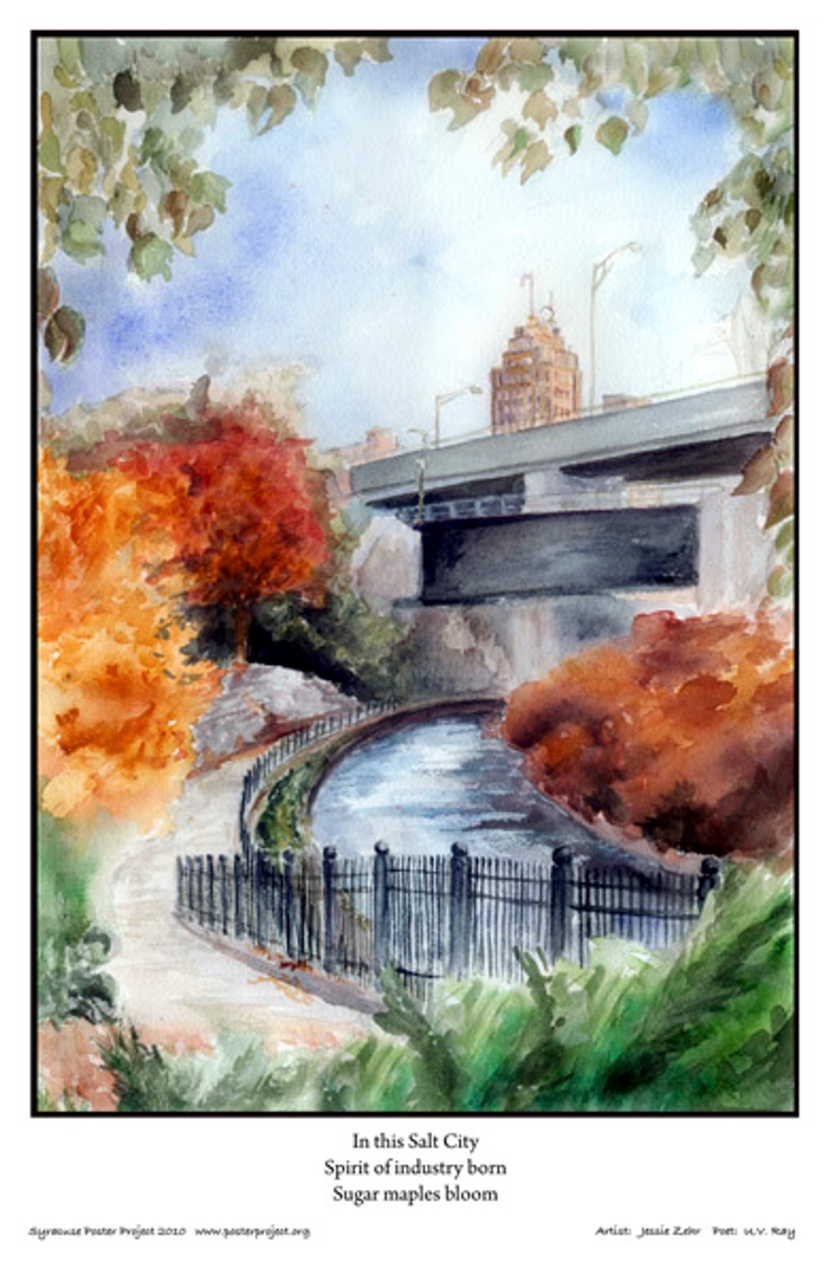
Poster Image

Item#: 2010SYR13
Purchase Details
11x17-inches, printed on heavy weight (100-pound) Hammermill cover paper. We package each print with a piece of chipboard in a clear plastic sleeve.
You also receive…
An information page with photos of the artist and poet, and hand-written comments from each.
A framing coupon, good for a 20 percent discount at Edgewood Gallery, a custom frame shop at 216 Tecumseh Rd., Syracuse.
Medium- and large-format posters are available by custom order. Contact us for details.
Poem Inspiration Location
In This Salt City
poster information
Description
In this Salt City
Spirit of industry born
Sugar maples bloom
I've been a poet and writer published in the small presses in Britain for almost 20 years, although my work has also appeared in the U.S., Australia, India and Canada. My first book, "The Blood In My Veins," was published in 2005 and I'm currently seeking a publisher for my second collection. My debut novel is currently being viewed by a publisher.
The haiku was inspired by a visit to Syracuse in 2005. I wanted to capture a sense of the city's thriving industrial past, juxtaposed with new evidences of regeneration and hope. I thought the symbolism of the flourishing trees perfectly illustrated how that independent spirit struck me as having never totally abandoned Syracuse. The people seem to retain a strong sense of identity.
I liked this poem because it gave a description of Syracuse, but it was also vague and allowed me the most freedom. I also liked that it touched on some of the history of Syracuse. I'm a local, and I like so many parts of the city; this poem just brought out thoughts of Syracuse.
I walked all around the city for this, and at this one point noticed you could see all these trees, bright and colorful sugar maples, as well as city buildings and highway—all the things in the poem together.
I started out doing the poster in a different medium, but ended up in watercolor, which is more spontaneous; it makes me loosen up. Watercolor is a little harder to control, so the blending of colors may not be exactly what was planned. I framed the picture in the trees, and decided to use a font that was neat and classic.

